Reducing Friction: Making products that stick
Why we love windows and macOS?
During the 1960s & 70s, our computers had outgrown their earlier definition of just being smart calculators. You could save files to disk and have multiple running applications with multiple users. But all the functionalities were exposed to users and hence breaking the system was easy than controlling it. Then, shells or CommandLine Interface (CLI) were introduced. CLIs would only expose certain functionalities to the end-users. This simplified the usage of earlier computers, but common users still had a hard time using it. Then came GUIs that would change the computer world forever and how we interact with our devices daily in our lives, from smartphones to smart TVs.
The Graphical User Interface (GUI) was destined to win this race. The Xerox PARC and Apple Lisa OS were among the first GUIs ever developed. Soon, GUIs were an instant hit. VisiCorp Visi On, Mac OS System 1.0, Amiga Workbench 1.0 all were the new GUIs based OS in the market.
In 1985 In this year Microsoft decided to jump on the whole graphical user interface craze and released Windows 1.0x, its first GUI based operating system. This would change things forever and lead to the creation of one of the most successful OS franchise known ever called Windows.
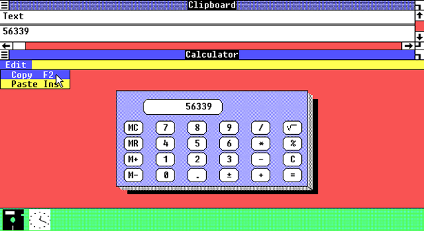
Figure 1: Microsoft Windows 1.01, Source: makowski-berlin.de
But what made GUIs instant hit when the same task could be performed in CLIs and with better customization? GUIs were designed to do the one thing that makes products stick with the users for a long time, Reducing Friction by simplifying the process of interacting with computers. You no longer had to perfectly remember long texts of commands with little to no rooms for error. You could just point & click and this was the power of GUIs that made computers accessible to even non-tech users. This broadening of tech horizons was possible only by simplifying tasks and operations and hence, reducing friction.
Homosapiens & the Google Vs. Yahoo! battle
Ever since we were hunters and gatherers, we needed to make quick decisions for our survival. If every decision was to be made with a conscious mind, we wouldn't have progressed this far as a species, because taking conscious decisions are taxing to the brain. Consequently, Our brain hates taking conscious decisions and relies on shortcuts and biases we developed from previous conscious decisions over a long period of time. These shortcuts and biases help us in saving time although they can sometimes lead to some very irrational decisions too. But how is it related to our study of user friction and search engines? The most important reason your users seek to reduce friction is for their need to reduce taxation of decision making on their conscious brain.
Here is an image of earlier days of Yahoo search engine when Google was still in Nascent stage -
 Figure 2: Yahoo Homepage, Source: The Complete History of Search Engines • SEO Mechanic
The difference between homepages of the both search engines is quite evident. The Yahoo search engine homepage is cluttered. It has too many links, too many texts, too many images and no breathing space at all. This is taxing to our brain has it now has to skim through the whole page with more efforts and find out where the important information is.
Here is the homepage of Google in it's earlier days -  Figure 3: Google Homepage, Source: The History of Search Engines - A Timeline
The Google's homepage looks clean and has the search bar right in the middle. Clearly indicating our brain where it should focus. Our mind is happy as it now doesn't have to spend it's valuable resources like concentration for this task. If our brain is happy, so are we. Google's clean homepage made it clear why it won. It had a clear goal of making life of the user easy by reducing the friction. The philosphy is not only constraint to it's homepage, which till this date is as clean it was when first introduced, but it extends to other decisions too:
Search prediction: removing friction of writing full sentences to convey our need
Search correction: removing friction of writing grammatically correct words
Keeping only useful elements. The recent version of google homepages on chrome has only a single searchbar with no buttons or links whatsoever. This reduces the friction even further.
These design steps help mind to take subconsicous decisions like what to do next. When you can guide the user throughout your service/product without them spending their consicious mind's resources you will make ever lasting products.
A good product maker knows the importance of reducing the friction their users face when interacting with their service. By simplifying the user experience with your product, you are making sure the experience with your product or service is enjoyable, and the user will stick with your service or product for longer.
What is friction?
Here is a simple definition of friction on www.bbc.co.uk -
Friction is a force between two surfaces that are sliding, or trying to slide, across each other. For example, when you try to push a book along the floor, friction makes this difficult.
One of the more important point to note is:
Friction always works in the direction opposite to the direction in which the object is moving, or trying to move.
When you are create a new product or a service, users will be interacting with it. If there is too much friction, users will have to apply a lot of force from their side to overcome this friction, and after a limited effort from their side, they will most probably abandon the products that require excessive efforts.
How to reduce friction?
As a product designer, you goal is to reduce friction your users experience on every step of using your product. Help them make that decision without too much analysis. Make it easy for them to make a decision, no matter how rational or irrational it is. Once you can use leverage this human need to reduct the taxation on mind's resources, you will be able to take decisions on the behalf of the user.
This theory of Reducing Friction doesn't solely help in making better products, But can help in as many ways as you can think of where decisions are needed by the user. Look at this famous advertisement for subscription to The Economist where you can see this technique in action -
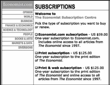 Figure 4: Google Homepage, Source: Decoy effect and irrational behaviour | Think Insights
The online edition is for 125.00 and the combo package of online and print edition is for the same $125.00.
Why would they price both the combo and print only at 125 dollars? To understand it let's first realise what the Marketing team of "The Economist" wants? Let's break it down into steps-
They evidently want to sell the maximum products to gain maximum profit. Plain and simple.
But how do they reduce the decision making process for the buyer? But using their brain's biases and beliefs to help them take the decision fast without thinking.
How can they help us make the decision? Here is how. One of the significant inherent biases we have is called the Zero Price Effect:
The "for free" items creates an emotional surge and leads us to make irrational decisions which we would otherwise avoid. Seeing FOR FREE written anywhere makes us want that product. Because why not!
Our brain, smart as always, deduce that if we buy the combo pack of $125.00, we are getting the web version for free essentially. The zero price effect helps us to prefer this option.
Another useful trick to help buyers make a decision is to help them compare the options but in your favor for obviuos reasons. Humans don't make absolute decisions. We make them on relative terms. A is better than B and hence, the decision of buying A is obvious. Help your users compare the options. The first option is 125.00 for web and print. It is hard to decide because in the first one the price is low but so is the number of products you are getting. The Last one, has more products but with higher prices. It is not easy to compare the options. Introduce a third option, $125.00 for print only. Compare the first two now, the web only and print only, hard to make a decision because both services are different. Compare the print only and Combo and it becomes crystal clear that last option is much better. This kind of calculation happens in our subconsicous without us even knowing based on our previous experiences, shortcuts, and biases we have developed.